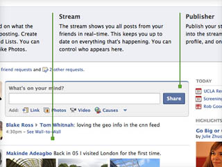
Two weeks ago, BusinessWeek’s next Design and Innovation blog asked for my thoughts on this month’s Facebook home page redesign, as a kind of follow-up to my thoughts in those same virtual pages a year ago.
I was asked to opine on the new design without having viewed the actual live site, which was launching the following week. This seemed reasonable to me at the time given that the site’s new features were announced, illustrated, and widely-known ahead of time (via a very comprehensive home page preview announcement) to anyone who was paying attention to that kind of thing.
I was really excited about the real-time feed user experience described in the home page preview. My exact words:
The new FB real-time home page is pretty cool, actually… it’s crossing the line between the old-fashioned page-based web and the live experience of television and broadcast media. In this case, it’s broadcasting from friends to friends — which it always was, of course, but now it’s more visceral and more real. I think people will love it. They’ll be glued to their screens, and will want to add more friends and applications just to increase the flow of content on their home page.
This is “Web 2.0 Complete”: When web people use the term “Web 2.0”, they mean two different things. First, they mean the social web, where *people* make (and are) the content. Second, they mean the pageless web, where web sites react dynamically and fluidly, without page reloads and refreshes. The new Facebook design combines both of these.
I thought it was kind of clever, if a little corny, of me to note that the new Facebook home page was simply conforming to some kind of basic “Web 2.0” bandwagon orthodoxy, bringing the two flavors of Web 2.0 niftyness into one delicious treat.
But a week later when the new home page actually began to roll out and replace millions of Facebook users’ old home pages, the backlash was immediate and seething and nearly unanimous (a Facebook poll found 94% of users didn’t like the new design). Oh man was I embarrassed! To have praised a user experience so breathlessly only to have my opinion immediately contradicted by the public’s rabid scorn!
Turns out, however, that users were complaining about the new page’s lack of real-time status updates from your friends. And yet Facebook had already clearly and prominently promised that feature as part of the redesign. In fact, I based the core of my analysis of the new site on that very feature, which they had already promised to deliver. They deployed the new design with much fanfare but without real time status updates.
Betrayed! Betrayed by a press release! There I am, praising a non-existent feature. Like an idiot.
Well, happily my premature praise no longer needs to cause me so much shame: Today Facebook has announced that the real-time reporting is going to occur after all. So the BusinessWeek report won’t be such an embarrassment to me after all.
Of course, this is the second time Facebook has announced this feature before delivering anything. Fool me once…
Comments
2 responses to “Web 2.0 Incomplete”
I think also that Facebook users are very resistant to change in general, and for very little apparent reason. The “Newsfeed” of the first Facebook redesign was at first met with near-universal scorn but grew to be the site’s most popular, sticky feature. I would be willing to bet a good percentage of that 94% were drawn in by mob mentality.
I’d like to point out one small thing: 715k users voting against layout change are not 94% of FB users. It’s 94% of users who cared to use some stupid FB application to vote for/against changes. Arguably the same amount of people would vote against any change.
Just like with any anti-something poll, people who simply don’t care or are happy with what they got have less incentive to vote. This is even more likely to happen since you have to “install” a new FB application to vote.