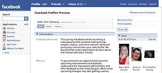
Facebook is allowing users to subscribe to view periodic updates of various redesigned site elements that are under development.
I was interviewed last week for an article on BusinessWeek.com, Facebook’s New Facelift. If you didn’t already know, Facebook is in the final stages of a redesign process. BW asked a few designers for their views. I had a few thoughts:
First, Facebook has been sharing and previewing their new designs to the public, which sounds like good cluetrain-thinking, treating their product as part of a conversation with their users. Interestingly, the dialogue has been primarily with their development community, not with their entire user base. It makes sense to involve developers — when the site relaunches, developers will need their apps to work with the new functionality.
Opening the redesign process to the general public, on the other hand, would have opened the floodgates to lots of very specific design input that they might not want to have to deal with. I know very well the kind of angry emails dedicated users and fans send after a major redesign — when Behavior redesigned The Onion, for example, the immediate email and message board response was vicious and almost entirely negative — but we were warned in advance by The Onion’s team that even the littlest changes to their site inevitably generate thousands of angry emails from trolls users. In the BusinessWeek article, I refer to this reaction as “cantankerous”. I’m surprised I used that word, but it is a great term to describe how a great many people respond to changes in design.

Second, I was struck by how much Facebook’s redesign is almost exclusively focused on the site’s fundamental information architecture.
The site’s new information architecture will enable end users to play with their own page’s information architecture, allowing them to change the tabs that appear at the top of their profiles (using a little plus sign to add new tabs of their choosing).
The redesign will make no changes to Facebook’s core branding and visual vocabulary, nor will it give any new special visual design tools to end users. Compare this to MySpace’s long-standing strategy of allowing users to customize their page’s visual elements — colors, fonts, etc.
This struck me as an interesting development: Normal everyday people are becoming information architects, and companies like Facebook are giving them the tools to play with the navigations and structures of their own data. Pretty cool.
Comments
One response to “Facebook, BusinessWeek, and Me”
Welcome to our humble pages. 😉